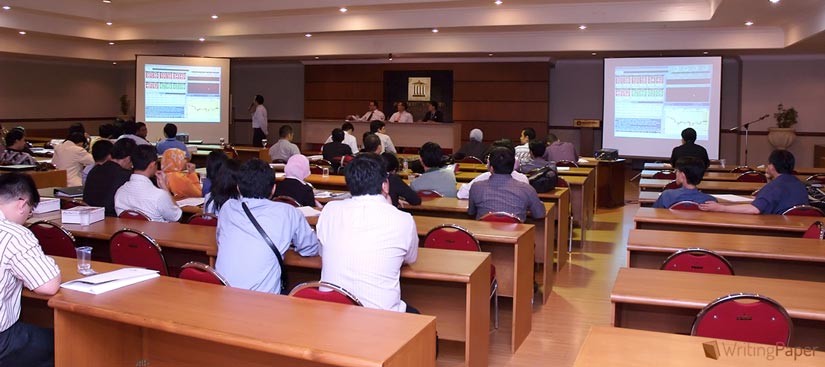
When it comes to a creation of a PowerPoint presentation, many of us can feel confused and frustrated due to the inability to make up an adequate and good-looking PowerPoint presentation that will catch the eye, talk on a topic in a concise but informative manner, and showing your distinguishing ability to operate with data and information. In this way, we prepared for you a list of the most useful tips to boost up greatly the level of your PowerPoint presentation.
What is to Consider?
- Topic – Your topic must give you a hint regarding the content of PowerPoint presentation. If it is connected with art, the presentation surely has to include some pieces of art, illustrating a described material verbally;
- Purpose – The PowerPoint presentation is a type of assignment like any other that has its aim. For example, you can be asked to compare something or discuss a phenomenon, or propose a set of argumentation regarding some topic. Your task is to present them via PowerPoint in an accessible manner for your audience;
- Audience – Consider people that will hear you and watch your presentation. You should take into account their knowledge level in a chosen scientific field, their age (pupils, college students, or experienced scientists), and their expectations;
- Presentation length – Most often, the assignment rubric from your tutor specifies such information. However, if you did not get certain instructions or the presentation is just your initiative, then orient to cover at least ten slides.
Check-List Before You Begin

- Make a decision what you would like to include into you PowerPoint presentation;
- Create a Word document and draft the outline for the content to be included on every slide;
- Select images and create tables or charts that will be inserted into the PowerPoint presentation;
- Think about approximate time every slide can take to be performed before audience. Make sure that only useful and significant information is included.
Design Principles
| Contrast | The contrast can be created through different size of constituents, color contrast between text’s parts, and type contrast |
| Alignment | Make sure that every part of your slide has its place, the constituents do not overlap each other. |
| Repetition | All visual elements have to be strong and unique; they have to vary within their form but to adhere to standardized overall style. |
| Proximity | If you have different pieces of information that can be grouped in separate blocks, make it! The usage of bullet points and lists is welcomed. |
Avoid or Even Forget it!
Microsoft PowerPoint presentation offers many options how to make an awesome presentation with all these shadows on all shapes, different colorful themes, transitions between slides, and action sounds.
However, slacken enthusiasm, dear reader, stop and think one more time about the audience for whom you are preparing this presentation. If it is PowerPoint for your relatives with photos from the last vacation, then fine, let everything pop up, move, and blind! Nevertheless, when your presentation is about engineering or medicine, even the purple color of theme can be out of place here.

Preliminary Review
- Make sure that the text on each slide does not occupy the whole space. Remember, only the most important information is to be shown on slide, other text will be voiced by you or is written in the “speaker notes” section;
- The presented data and information have to possess such characteristics as clarity and logical organization;
- Check whether the text and slides pop up as it was planned initially and everything is working in general;
- Moreover, your PowerPoint presentation must have an appropriate format;
- Before closing the file, proofread the whole text on the slides, make sure that your work is free from grammatical and punctuational mistakes.
Additional Hints on Presentation
- Remember, the PowerPoint presentation is an additional tool to support your ideas and thoughts, not to include them all. It is not an essay or research paper. That is why, you do not have to fill out the slides with a huge amount of text. In this case, the PowerPoint presentation will lose its purpose;
- The presentation must be visually attractive (yes, it sounds tritely), but the usage of appropriate to the topic images that will illustrate discussed topic and maintain your argumentation basis. What is more, if your topic implies the statistics and operations with it, then the use of tables, graphs, and charts are welcomed. It will give your presentation more value and create the needed effect on audience;
- Ascertain that the information included into the PowerPoint presentation’s slides differs from what “speaker notes” or the text you have prepared to voice.
- Think over the manner in which you are going to conduct your presentation. Deduce well the gestures, voice volume, and time when you will give time for the audience to apprehend presented on slides information.
Successful presentation, all in all, is a combination of various interacted factors. One of them is PowerPoint presentation which is aimed to support your ideas and booster the overall effect on the audience. The consistent balance among your personal style, usage of design tools, and good command of PowerPoint will guarantee you load ovations.
